

Autumn Mosaic – Tim’s Hill Abstract Forest Wall Art
$ 54.00
This isn’t just fall color—it’s fall translated into modern art. Created from the woods of Tim's Hill County Park, this piece layers luminous oranges, golds, greens, and hints of blue behind a bold lattice of dark tree trunks. The result feels like stained glass in a cathedral—dramatic, immersive, and unmistakably contemporary. It’s nature, reimagined for collectors who want their walls to feel curated, not cluttered.
Why someone should purchase it
- Gallery-forward statement: The abstract color field and strong vertical lines create instant “wow” from across the room.
- Modern energy with natural roots: It has the emotion of autumn, but the presentation is sleek, artistic, and current.
- Color that elevates a space: Rich warmth + cool accents make it versatile—perfect for pulling together a room’s palette in one powerful piece.
How it will look great in their setting
This artwork is especially strong in:
- Modern living rooms with clean lines and neutral walls (white, charcoal, concrete, warm gray)
- Creative offices / studios where color boosts focus and inspiration
- Entryways where you want an immediate conversation starter
- Loft, industrial, or mid-century spaces that pair well with bold, graphic art
Styling tip: let the piece be the anchor. Pair with black metal, walnut, stone, and linen. Echo one accent—mustard, burnt orange, or deep teal—in a pillow, vase, or rug for a designer-finished look.
Metal vs Canvas: which finish fits best?
- Metal print: Maximum luminosity and crisp contrast—makes the colors glow and the trunks feel ultra-defined and modern.
- Canvas: Softer and more tactile—adds warmth and a painterly presence that feels upscale and gallery-like.
Related Items


Red & White Saturdays — Wisconsin Badgers “Stripe Out” Panorama
$ 238.00
Bring the electricity of a packed game day into your space with this panoramic fine art photograph capturing the iconic Wisconsin Badgers Red & White...
View full product details

Wisconsin Badger Fine Art Print
$ 54.00
Wild, rare, and absolutely unforgettable—Wisconsin badger in its natural element, tucked into autumn leaves with that unmistakable, no-nonsense stare. This is the kind of image...
View full product details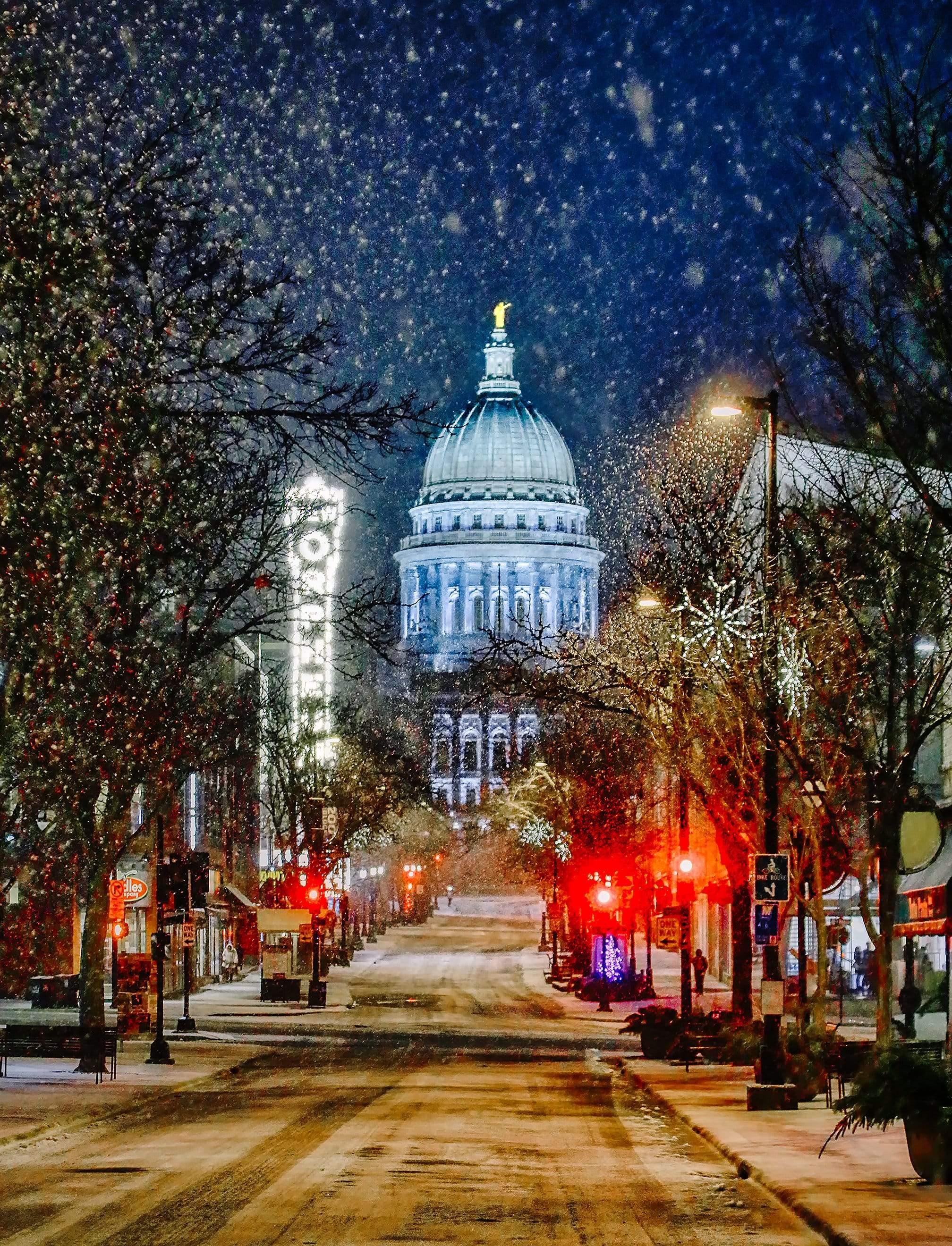


State Street Snowfall — Madison Capitol Glow
$ 54.00
This piece takes a familiar city scene and turns it into pure electric atmosphere. State Street stretches toward the Wisconsin State Capitol as the sky...
View full product detailsFollow
Sign up to get the latest on sales, new releases and more …
© 2026 Bob Hundt Photography.
Powered by Shopify